It's Friday! TGIF! I'm back with some more adventures in abstract painting on canvas! As you may recall, a few days ago I shared my first attempts at it here on the blog. I thought they turned out decent for my first try, but my favorite was this little guy which I hung in my living room:
I also had these two bigger fellas (still hanging out in my living room):
I mentioned I wanted to do some more work on the painting on the right, especially adding more white to make it brighter. Well, I covered up some of the darker stormy colors with some white, pink, and gold, and here's where I ended up:
Still crazy and colorful but I think it looks a lot "softer" with the fluffy application of the lighter colors. I'm going to move it into my office along with the other one and see how they feel up there. The upstairs is still pretty chaotic and crazy, so I'm sure this guy will fit right in. :)
I also completed the last smaller canvas I had. (I bought 4 total). I forgot to take any progress pictures - this one went pretty fast because I had a clear inspiration that I wanted to paint this time. I couldn't get this painting out of my head since the other day when I was gathering up inspiration for all of my blank canvases:
That's right. I was in love. I LOVE the colors and pretty much everything about this piece - I even did some more research to find the artist and her other works. The artist is Maurie Hartel, and the painting above can be found here along with some more of her work. Here are even more of her paintings, and here is her Etsy shop. She uses acrylic with a high gloss, which really makes the golds in her paintings shine, and they look absolutely gorgeous!
Of course, I don't have any high gloss, but I did use acrylics, and here is the painting I whipped up using Maurie's as my muse:
I'm really happy with the way it turned out. Pink is my favorite color, so I had to stick with it! The colors of paint I used were just red, white, gold, and yellow and just did a little mixing.
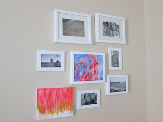
I thought it would be the perfect balance to the other painting I hung on the wall and decided to hang this one up there too! Perfect for some more pops of color in this room!
Here's how it looks with the chair, which I want to add a bright pillow to, like the Fiesta Floral pillow cover from West Elm I'm currently obsessed with.
Here is a view of the living room from the couch BEFORE I added the newest art edition:
And here is another view WITH my new artwork added :)
This is what you see as you are entering the house and living room. It's so cheerful and really wakes up the space! That's just my opinion though. Trent tends to think the opposite - He says it's too bright and hurts his eyes. Haha. Oh well. I love the color!
And speaking of color, there is now a bright BLUE vase atop my China hutch:
I think it looks pretty spiffy :) The vase was Trent's mom's that was still in the house when I moved in. It was hiding in a cabinet, so I decided to bring it out and replace the cheapo silver aluminum vase the hydrangeas were in previously. I definitely like the blue better. I was also thinking about getting a white pitcher or glass vase instead, but we'll see. For now I'm really loving the new pops of color in the room.


No comments:
Post a Comment